Next episode of elkement’s printing tests!
I had my math / code art Lissajous Three Four Five printed at a local print shop – as an acrylic print.
I am always anxious when unboxing such prints, especially when the digital version is a glowing vibrant structure on dark background:

Digital file created with JavaScript code, scaled down from original 5000×5000 pixels.
More about the math in this blog post.
Its natural habitat is a screen.
How could a print ever compare to this?
I was already pleasantly surprised by my recent canvas print test. But my reaction to this acrylic print was more like OMG OMG OMG IT LOOKS LIKE MY IPAD HOW IS IT EVEN POSSIBLE.
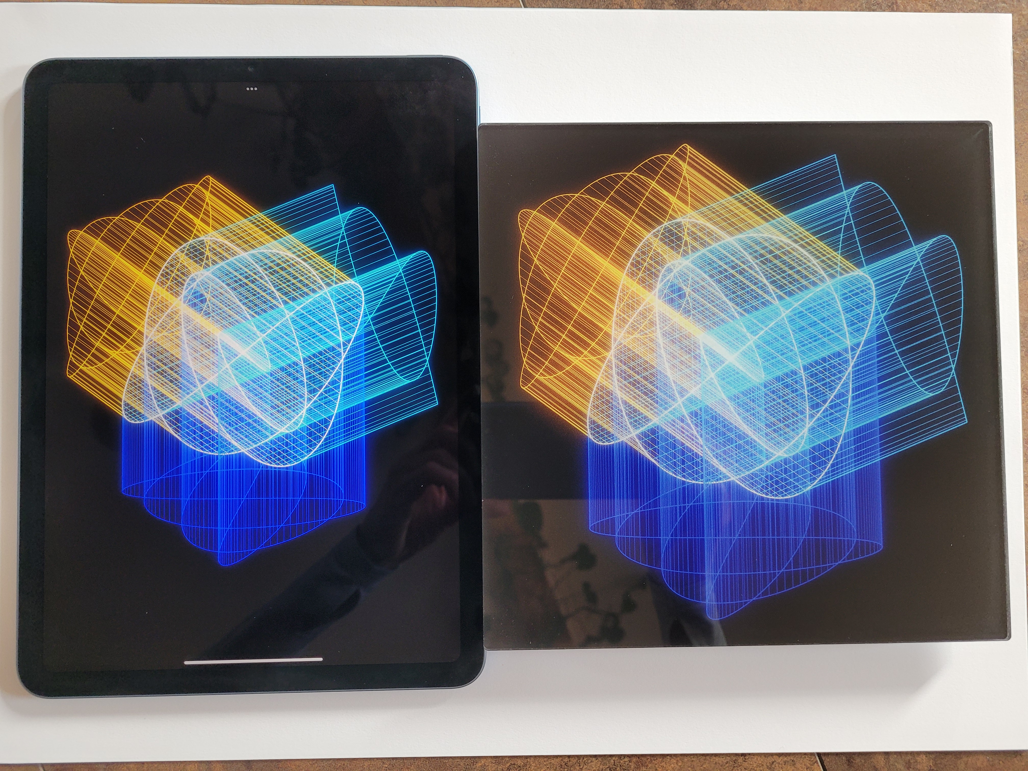
I took a photo of my iPad showing the art (to the left) and the 20cm x 20cm print directly next to it:

Left: Digital file displayed on my iPad. Right: Acrylic print.
Photo taken near a window in natural indoor light, but not directly hit by sunlight.
The photo of iPad and print is faithful – including the reflections of my hands in the acrylic print.
It’s the first time I tested acrylic prints covered with a backing layer of aluminum-dibond. This the same composite material I pick for my metal prints – a synthetic material covered with aluminum.
Bare acrylic prints without alu-dibond enhancement are slightly transparent: They glow when hold against the sun. It should help if they are placed on a white rather than a dark background. I don’t know how much the alu-dibond backing contributes as I have not printed the same image in both variants.
Bare alu-dibond is reflective without any coating. I can see this when my metal prints display patches of pure #FFFFFF white: In contrast to the rough texture of these matt prints, white spots are shiny. So, when added to acrylic prints, this layer might act as placing the bare acrylic print on a mirror.
I’d appreciate any printing expert to chime in and burst the bubble of my theories!
~
In the meantime, I will keep exploring my preferences for prints. Does something created digitally have to look screen-like when printed? Is digital art something ethereal that should only be shown as an installation with lasers and projectors?
I tend to think that if you print digital art, then the physical print becomes the artwork. It is not a lesser copy of a screen.
When I create digital art, I have (preferred) materials for printing in mind. Printing completes the artwork. I think this is why I am so obsessed with printing at the moment.
~


Leave a Reply